
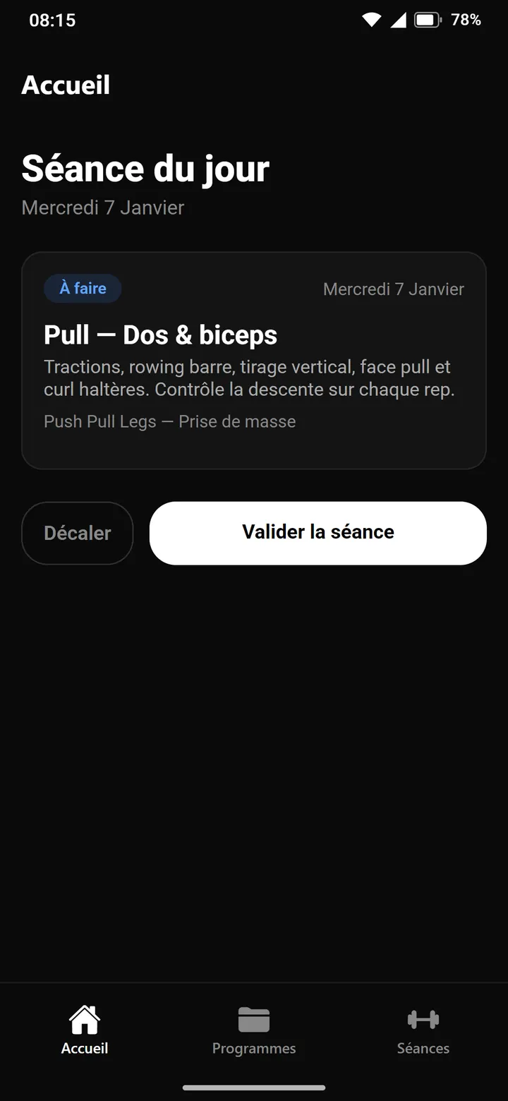
Today's session
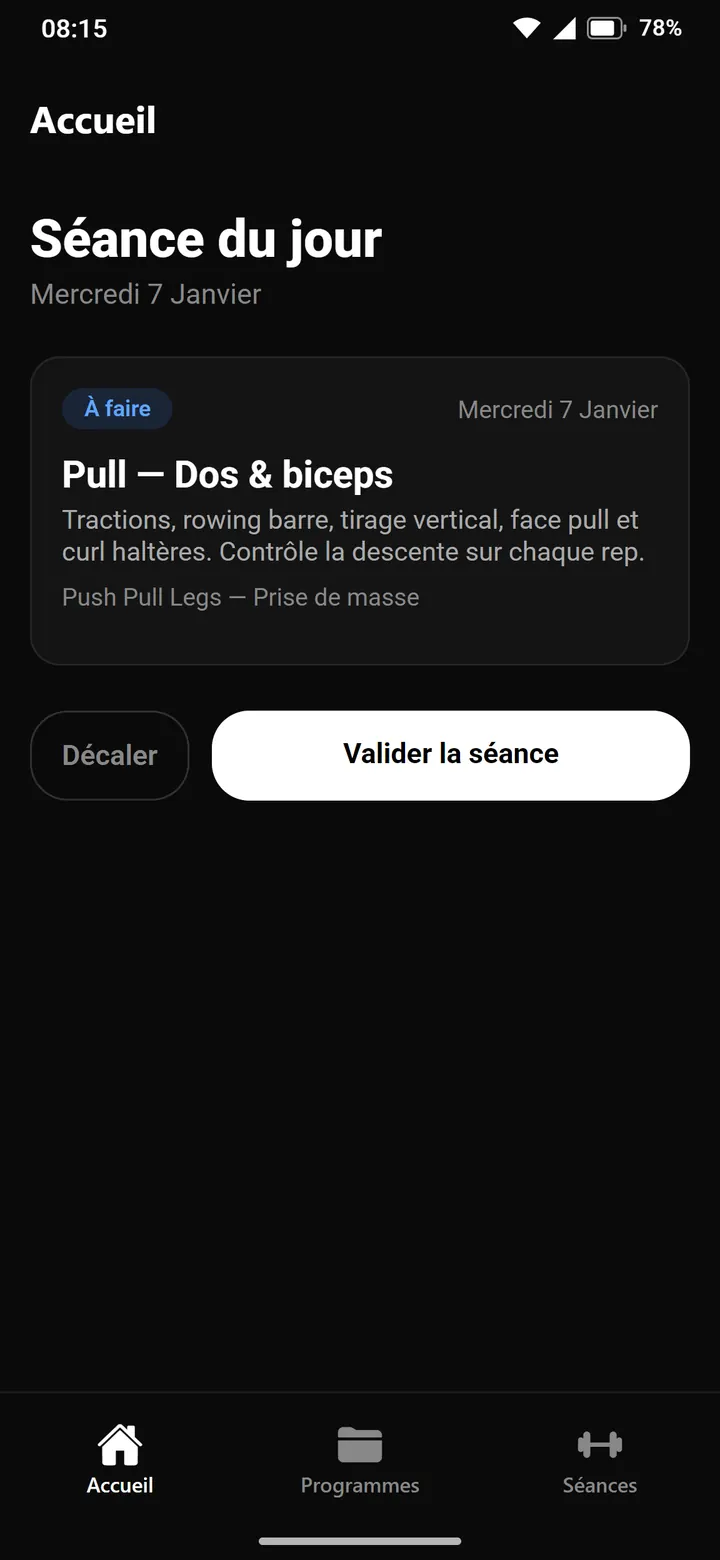
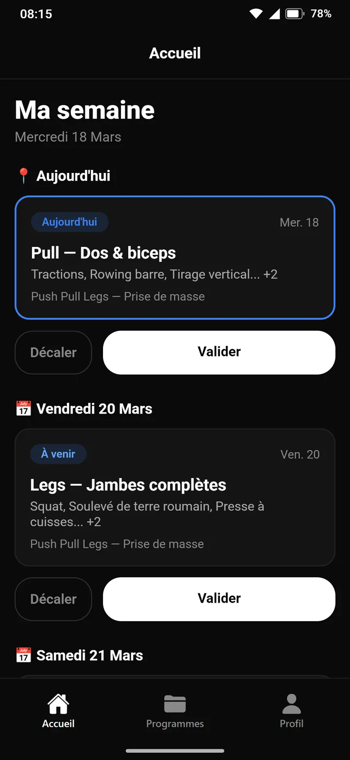
The first home screen is a single card: today's planned session, its program, and two buttons to postpone it or mark it done. The app is still called App Muscu and has only three tabs.
Behind the scenes
From January 6 to September 25, 2026: 42 versions of the home screen, rebuilt from the code of their time and captured as they appeared on an Android phone, with the same fictional athlete.
The film
Scroll through the versions, press play, or use the arrow keys.
Version 1 of 42
January 6, 2026
Screen dated Wednesday, January 7, 8:15 a.m.
Milestone Today's session
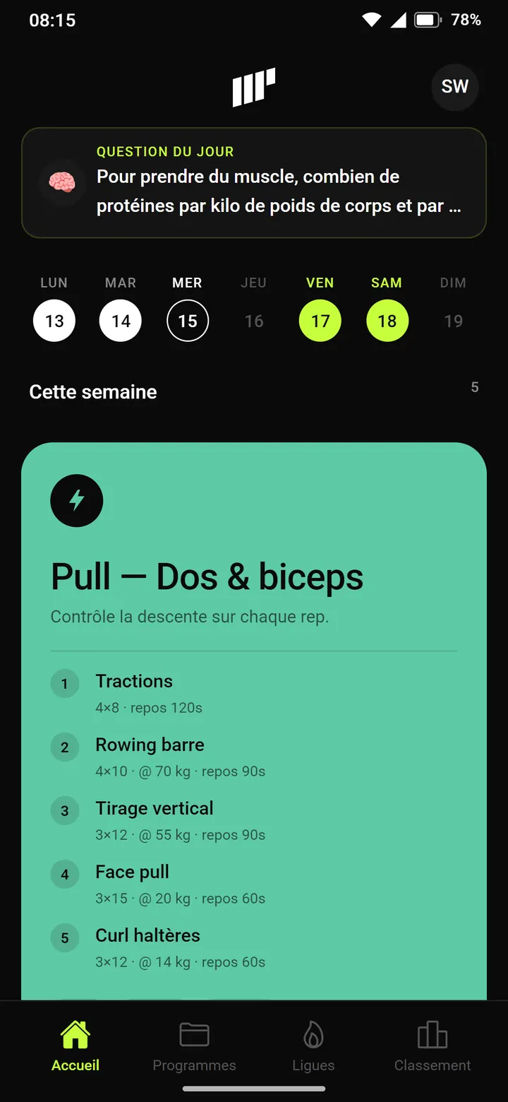
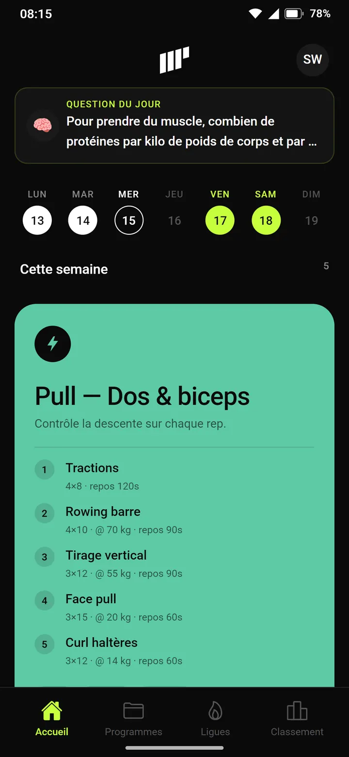
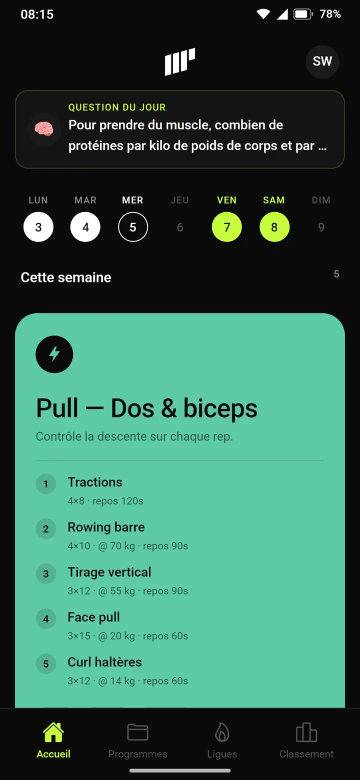
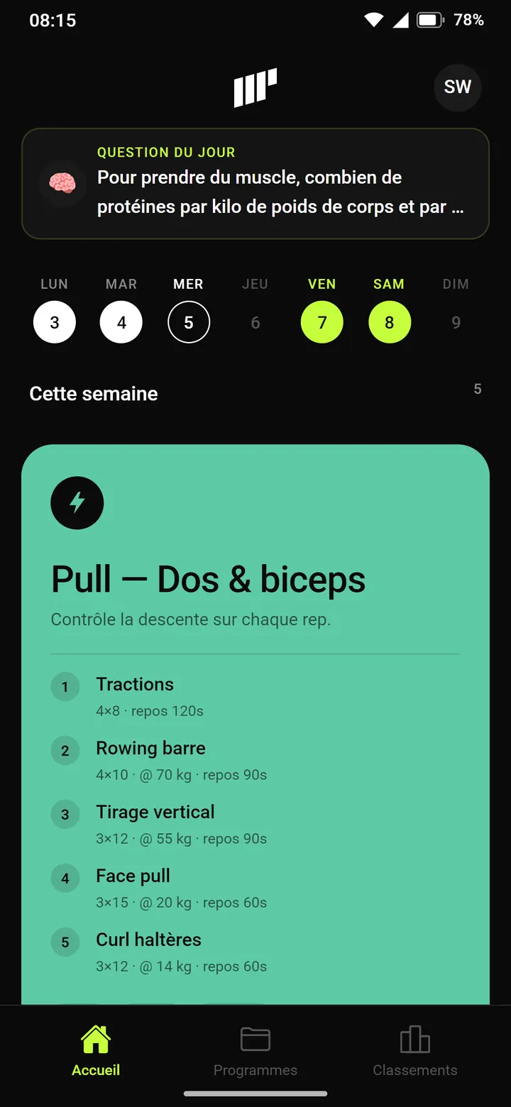
marks the versions described below.
Milestones
Each screen scrolls with your finger or mouse wheel, all the way down to the tab bar.
Screens are shown in French, the app's original language.
App Muscu becomes MyProgram in eight days. Black background, grey cards, blue for statuses.
The first home screen is a single card: today's planned session, its program, and two buttons to postpone it or mark it done. The app is still called App Muscu and has only three tabs.
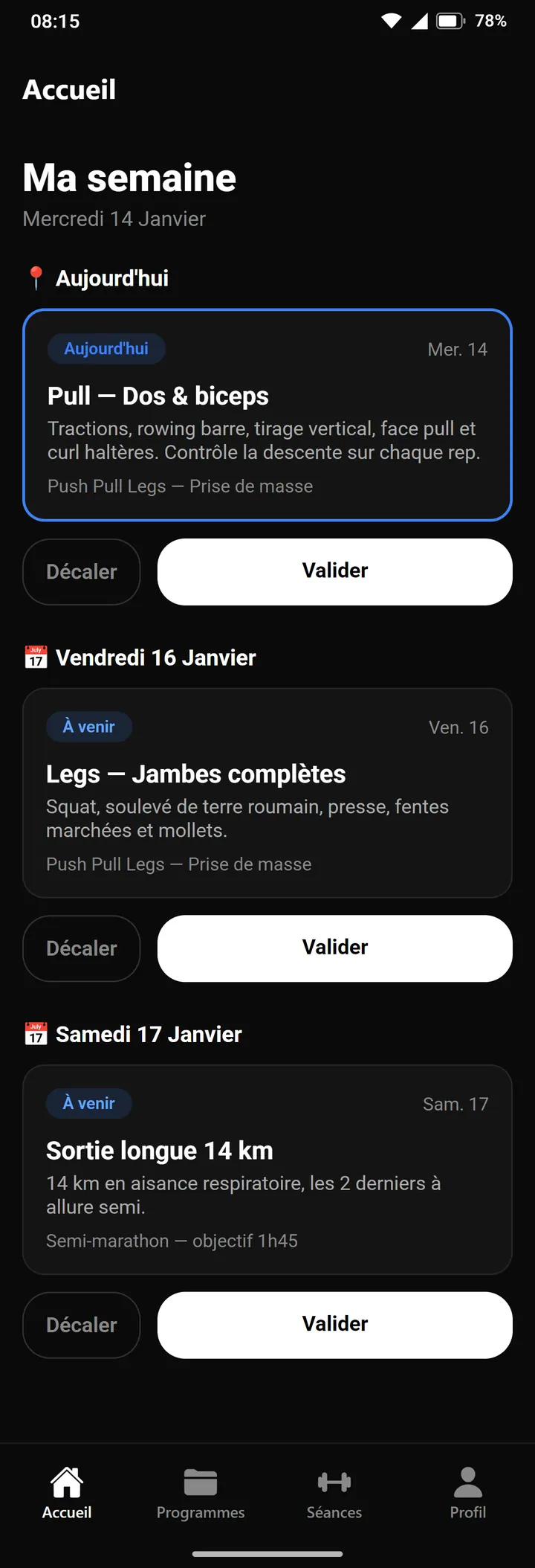
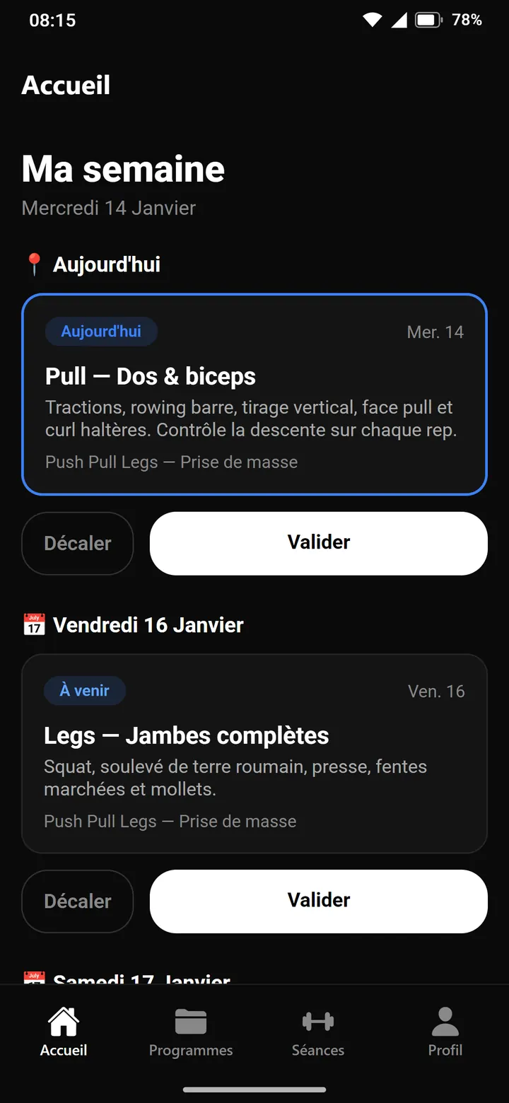
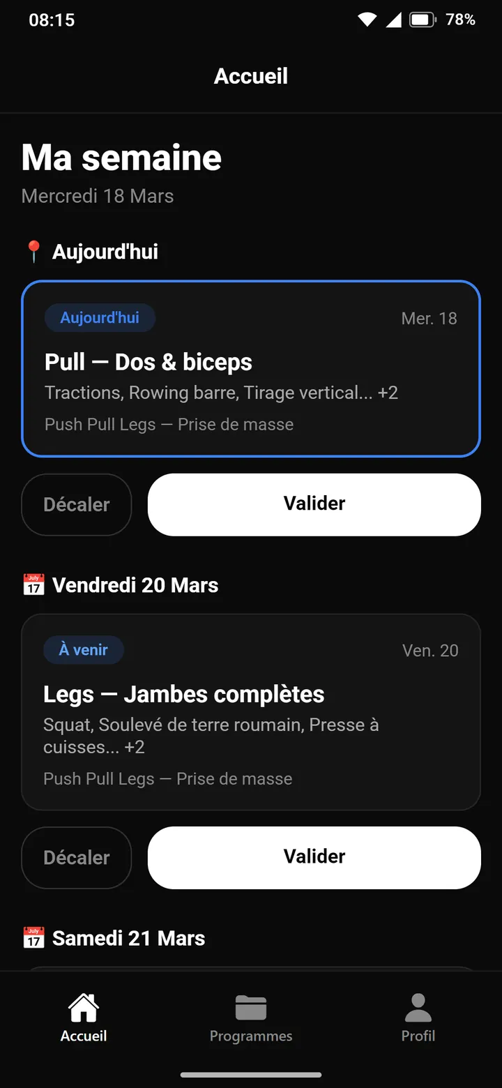
Eight days later, the app is renamed MyProgram and the home screen lays out the whole week. Each day gets a heading, each card a status chip: today, upcoming or late. Every session can be postponed or completed. Profile becomes the fourth tab.
See it in the film ↕ the screen scrolls
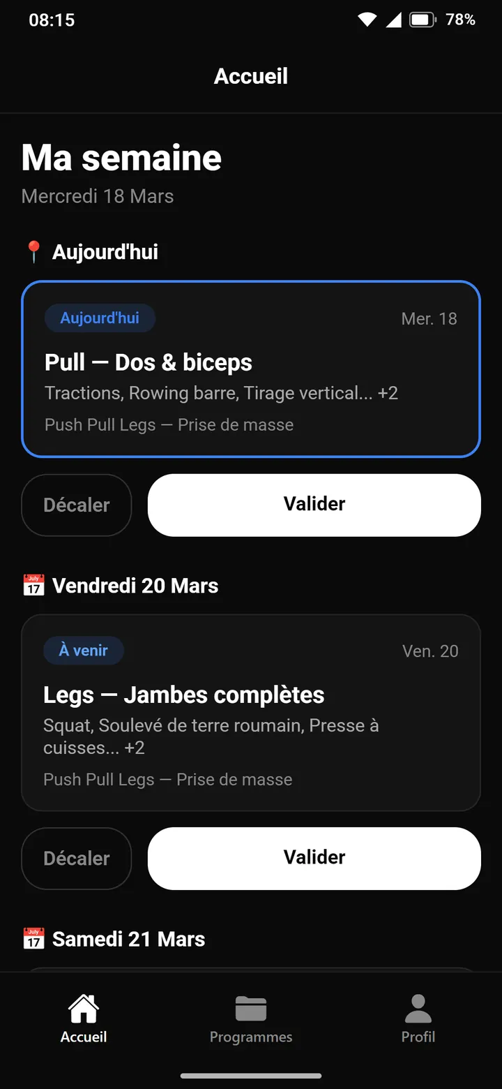
The home screen is still a list of days. Cards first show a preview of the exercises, then the full detail.
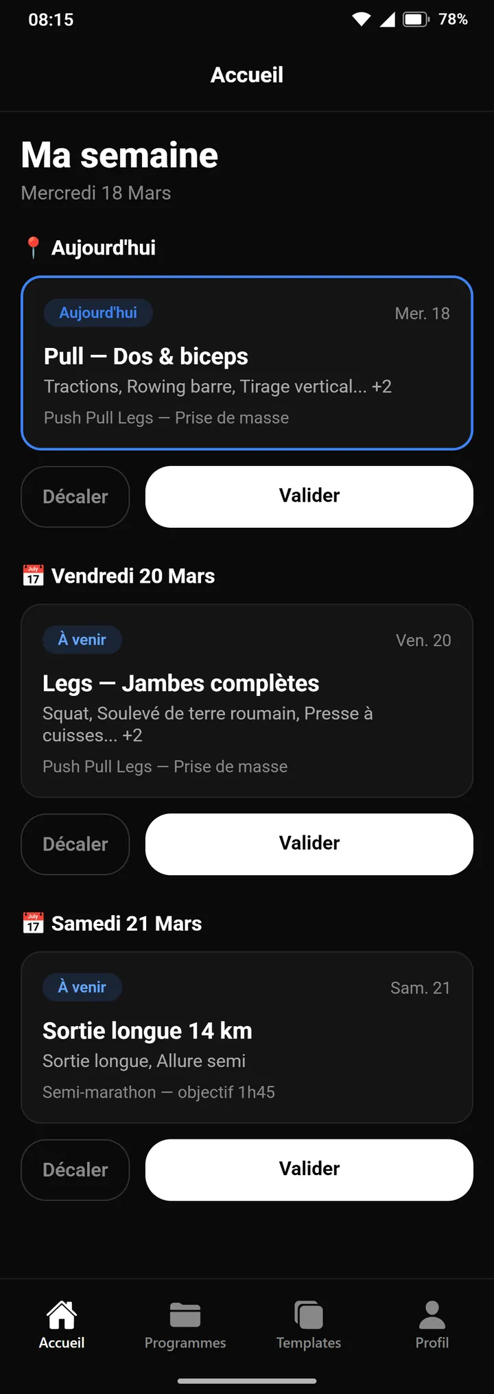
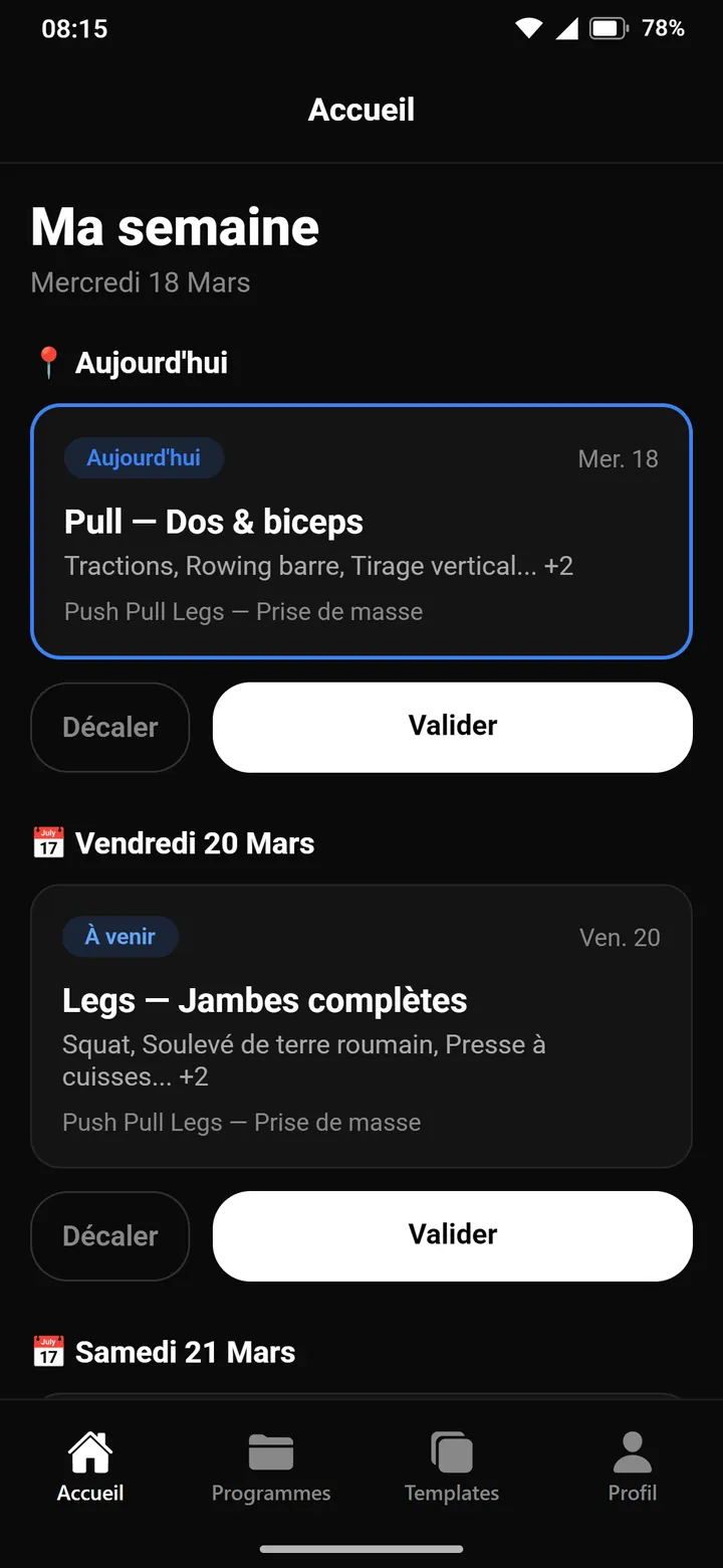
After two months without touching the home screen, a centered header replaces the navigation one. Under each session title, the first three exercises and a count of the rest. The Sessions tab becomes Templates, then leaves the bar two days later.
See it in the film ↕ the screen scrolls
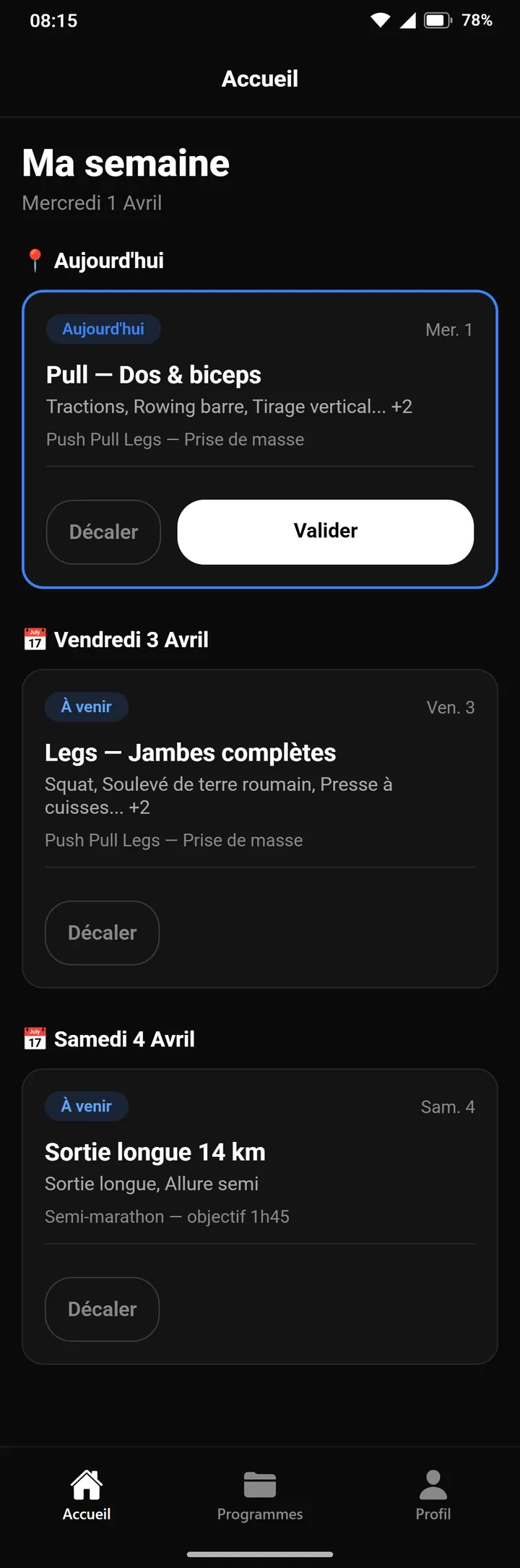
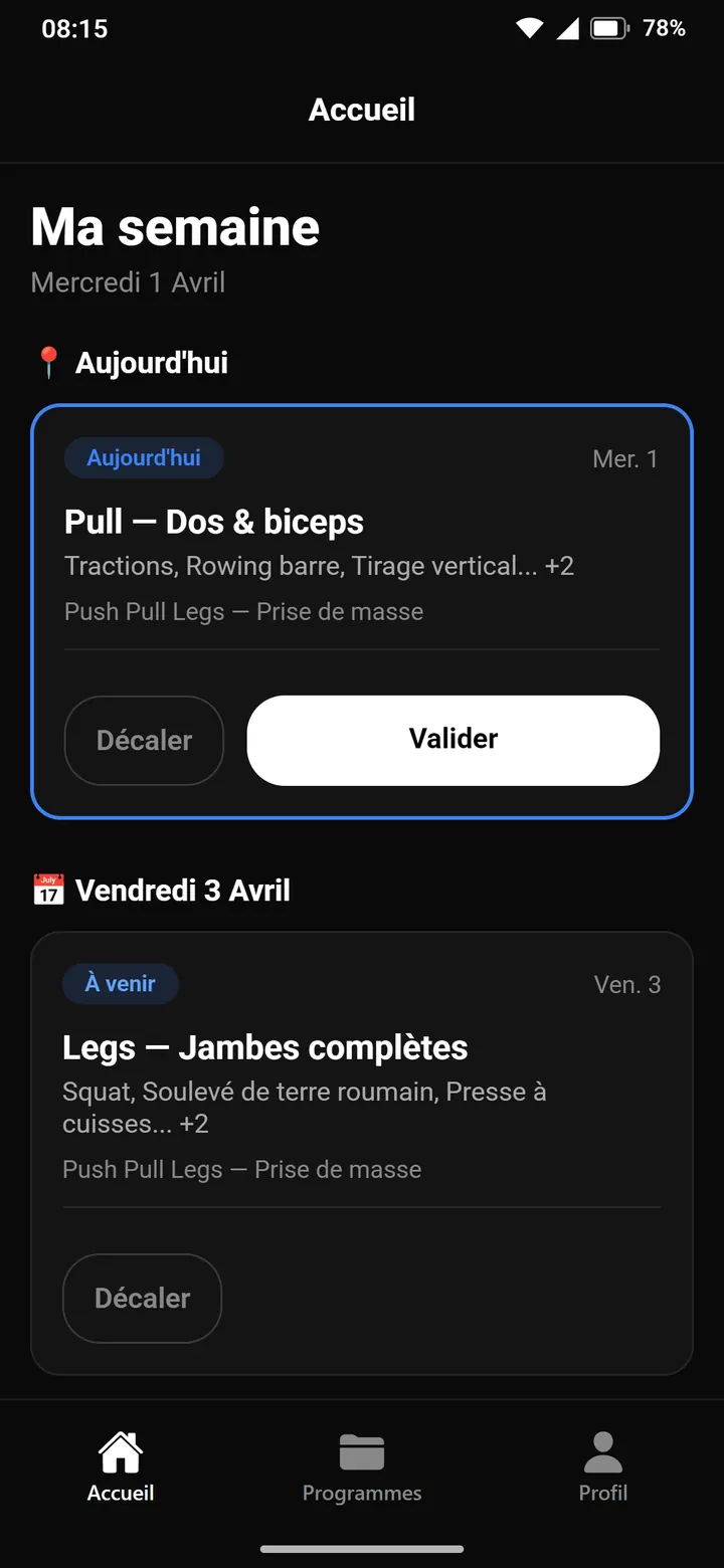
Postpone and complete move inside the card, below a divider. An upcoming session can no longer be completed, only postponed. When the current week is empty, the home screen shows the next one. The rest of v2.0.0 is about the program creation wizard and AI generation.
See it in the film ↕ the screen scrolls

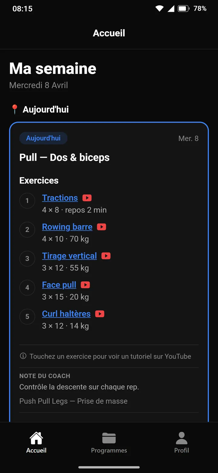
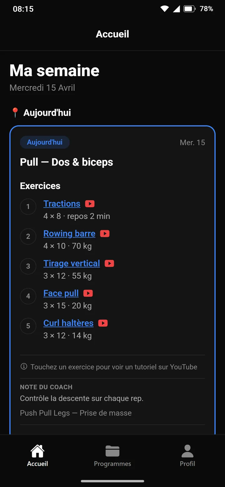
Each card lists its exercises, numbered, with sets, reps and loads. Tapping an exercise opens a YouTube tutorial, and the coach's note closes the list. To get there, sessions stop being free text: they are now stored as structured JSON.
See it in the film ↕ the screen scrolls
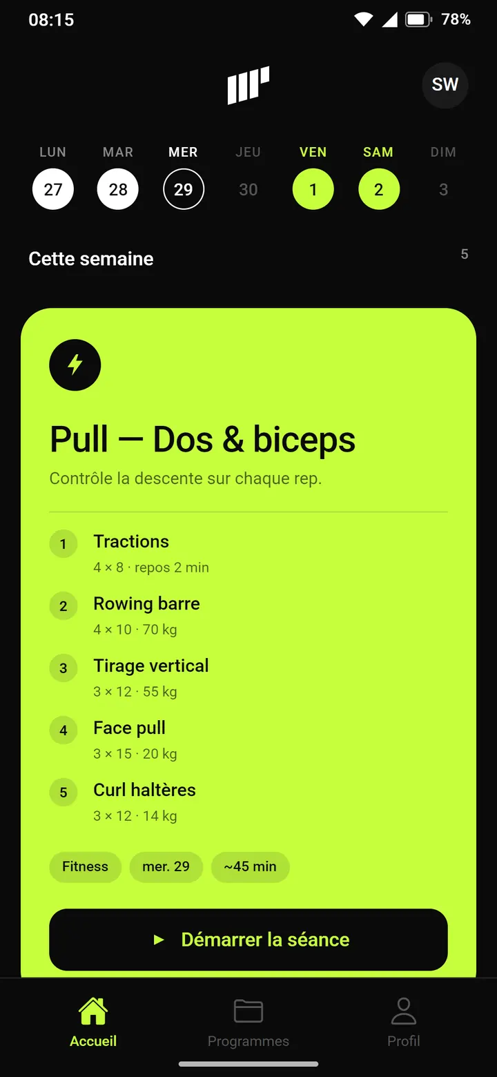
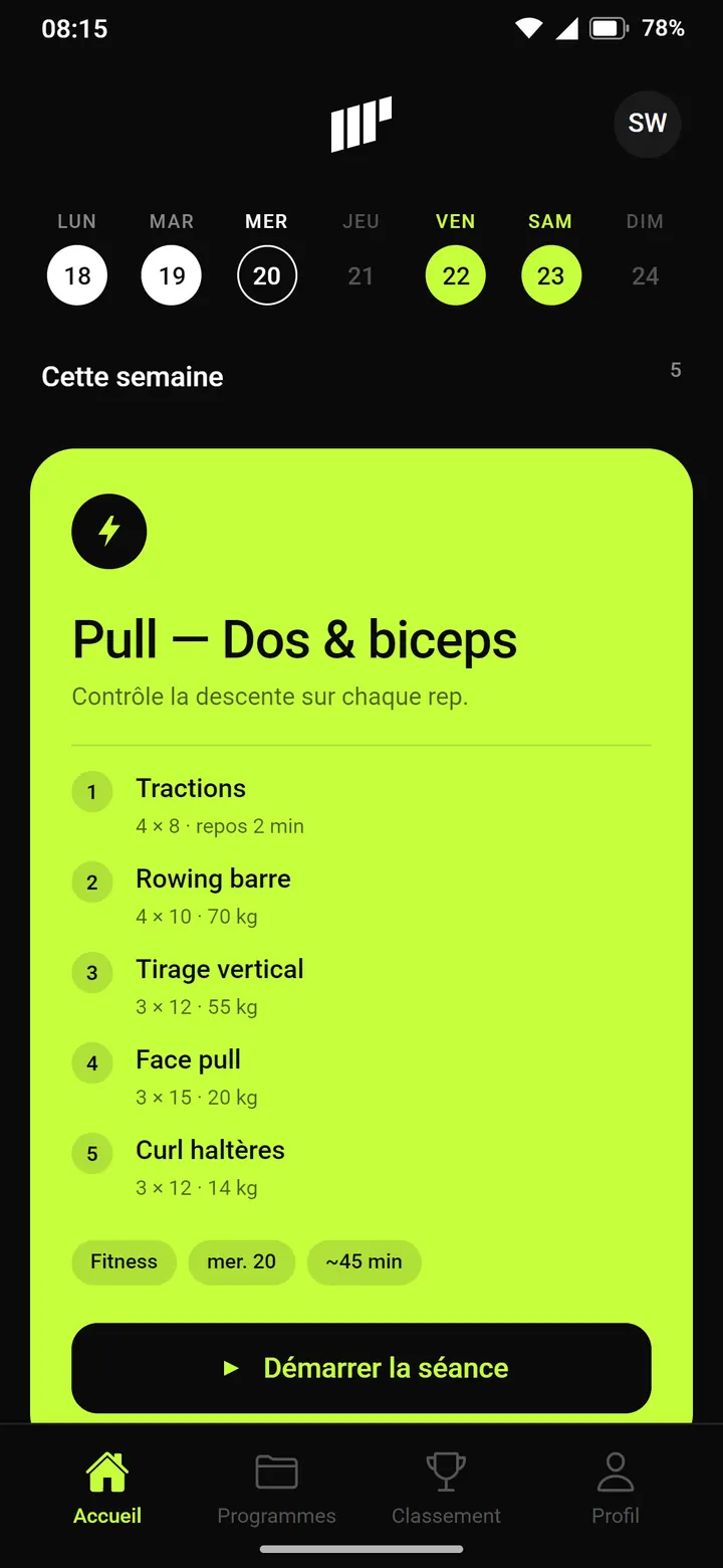
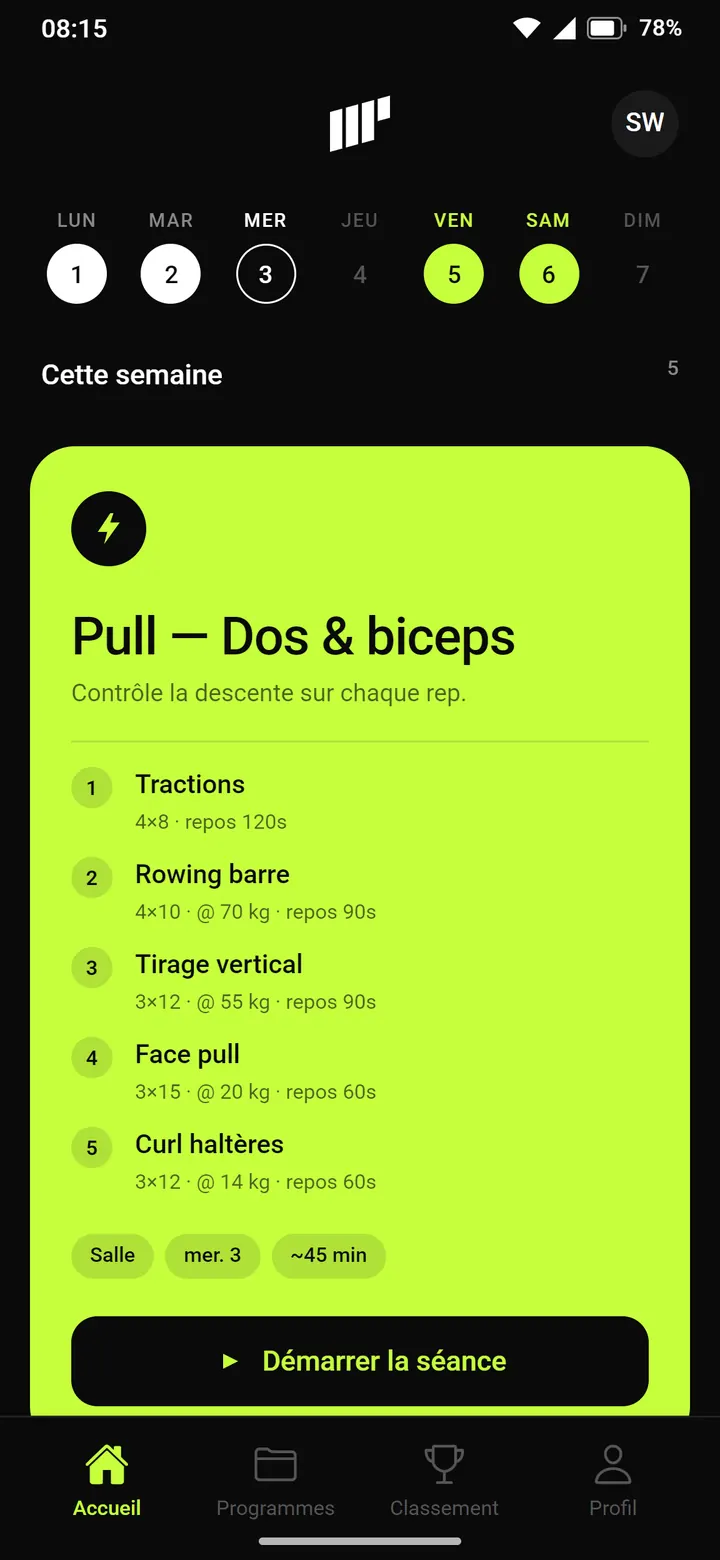
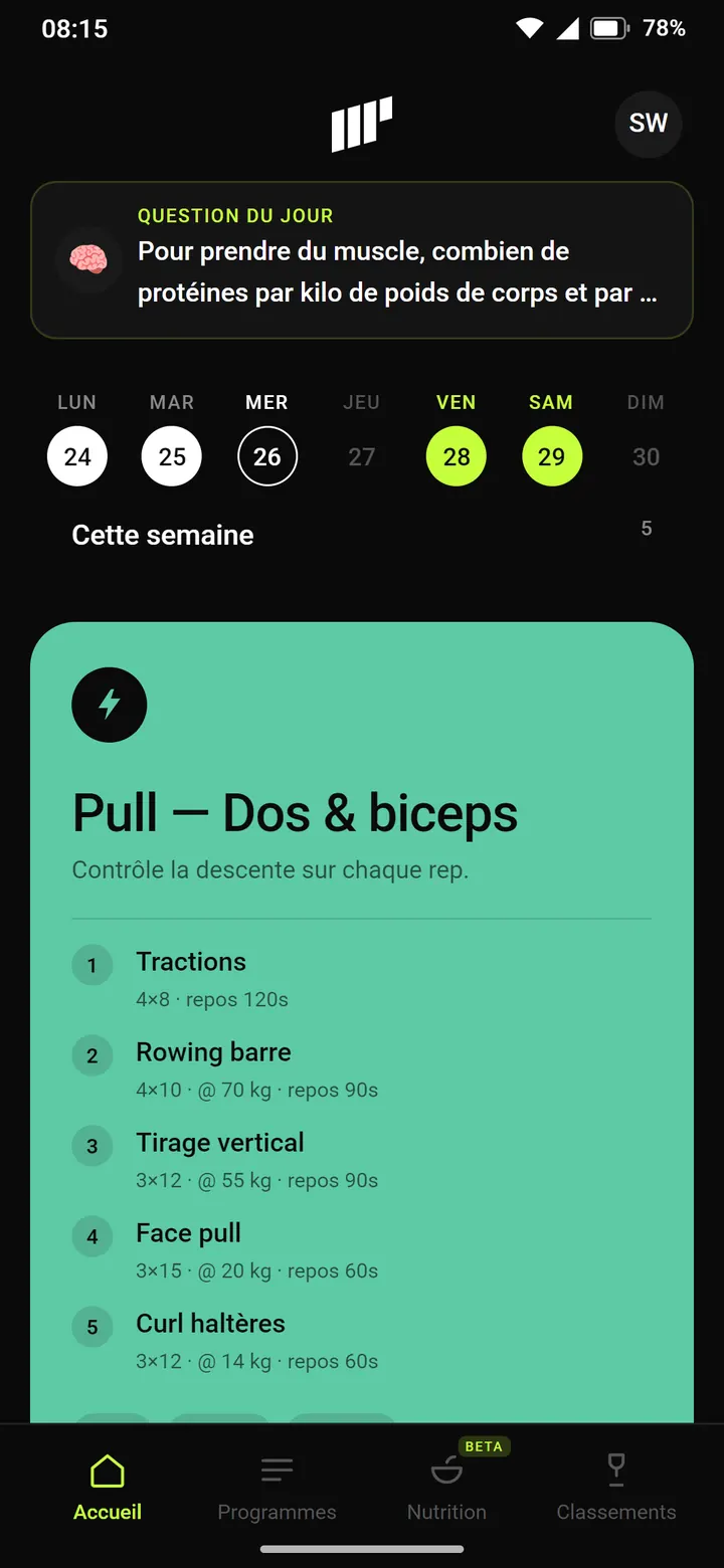
A real home screen takes shape: a week strip, a large session card, then one card per topic. Volt green becomes the signature of the app.
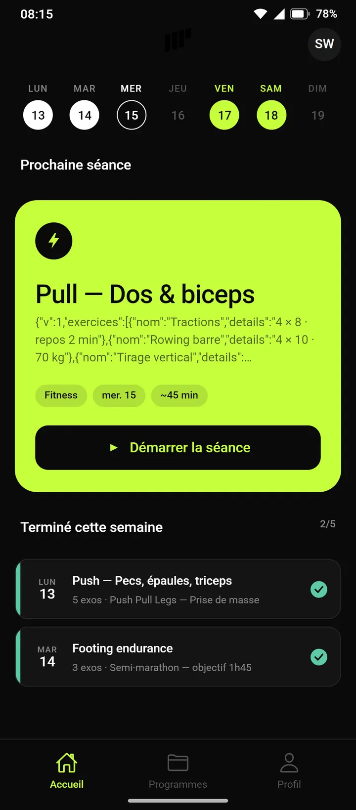
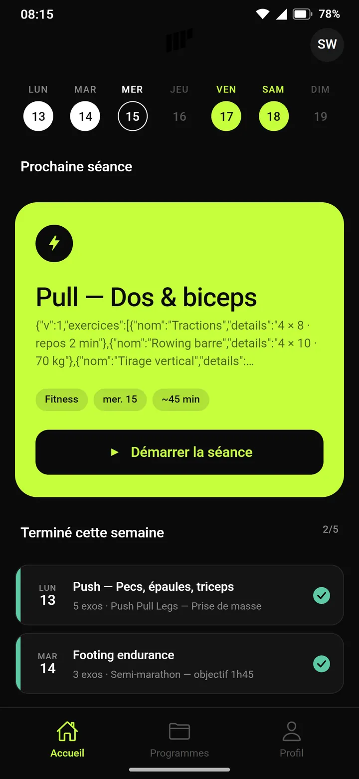
The first home screen designed as a screen. At the top, the logo and the avatar. Then the week strip: white for done, circled for today, volt for what's coming. The next session fills a large volt card, with its chips and a start button. Two teething problems: the black logo disappears against the background, and the card shows the session's raw JSON, fixed eight days later.
See it in the film ↕ the screen scrolls
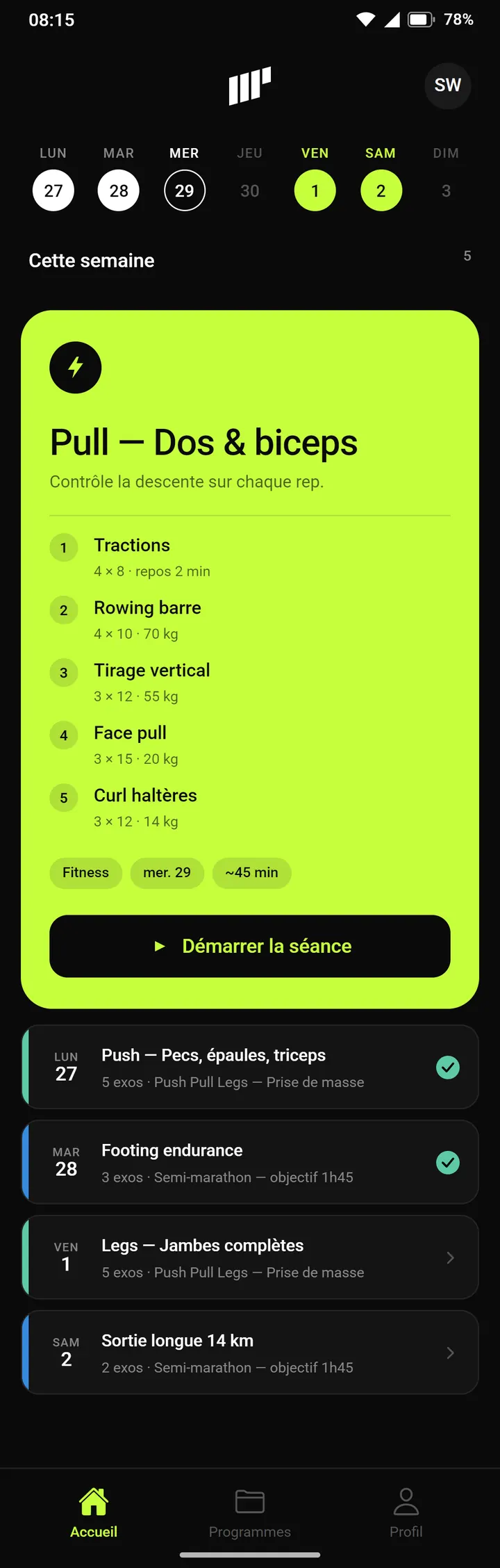
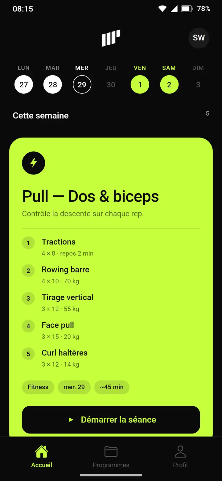
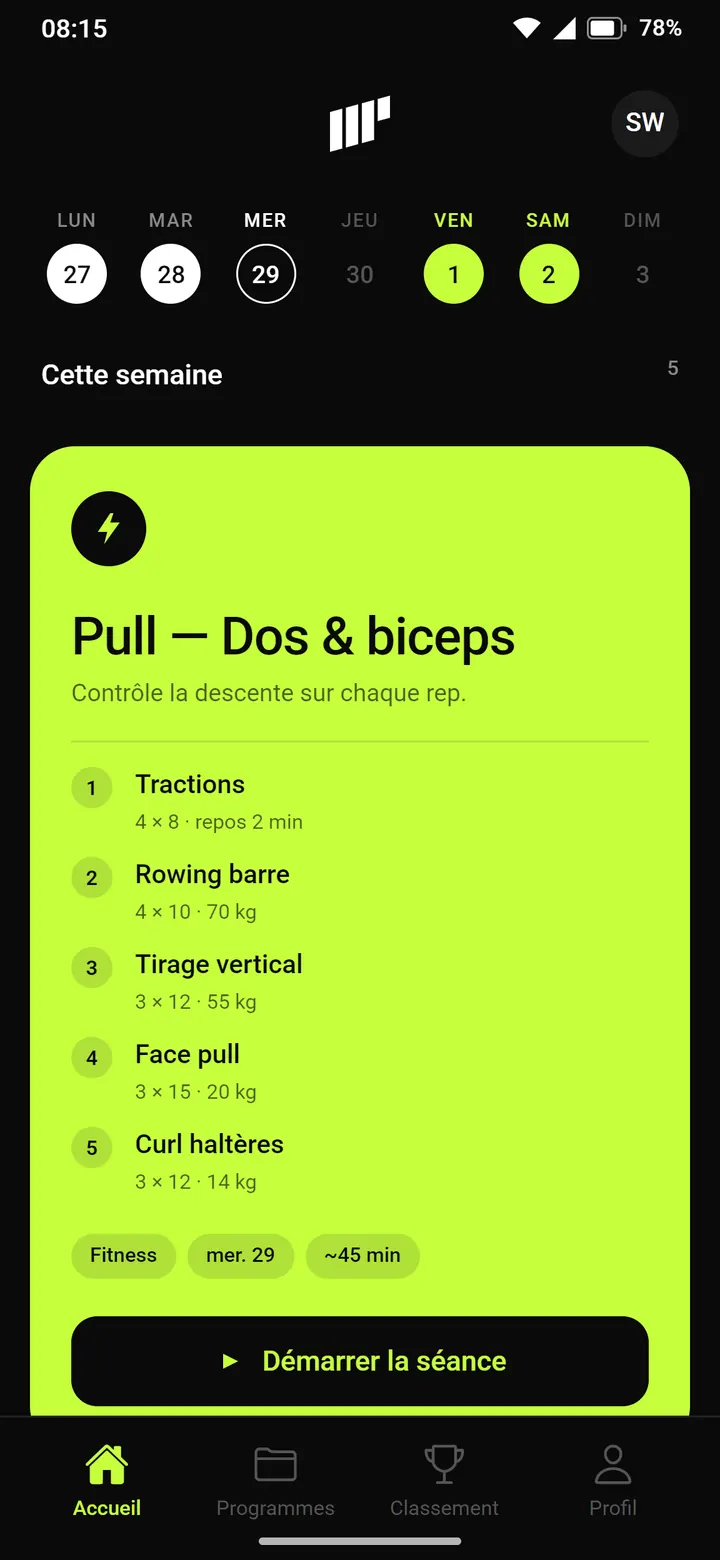
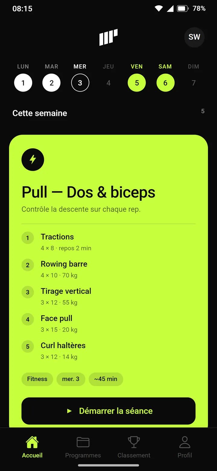
The volt card lists the exercises under the coach's note. Below it, a “this week” list lines up the other sessions in compact rows, with a stripe in the discipline's color: volt for fitness, blue for running. On May 2, the Ranking tab joins the bar.
See it in the film ↕ the screen scrolls
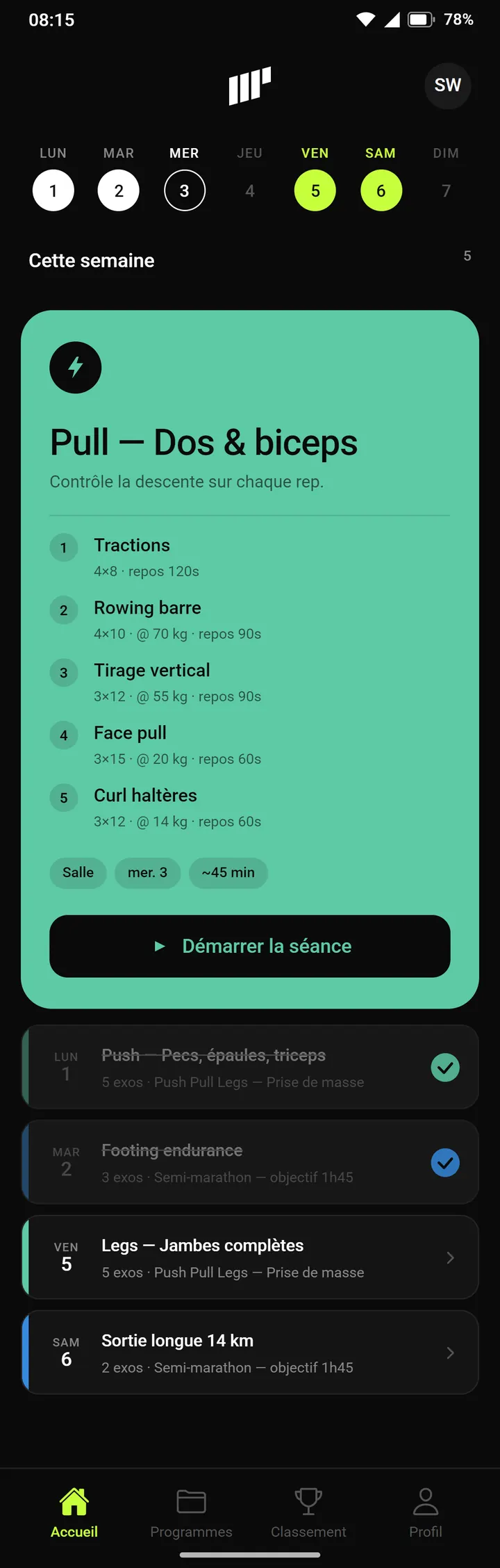
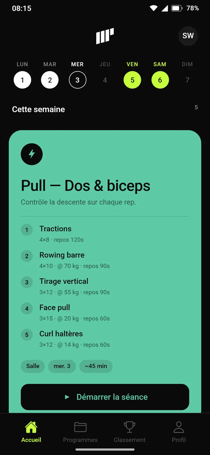
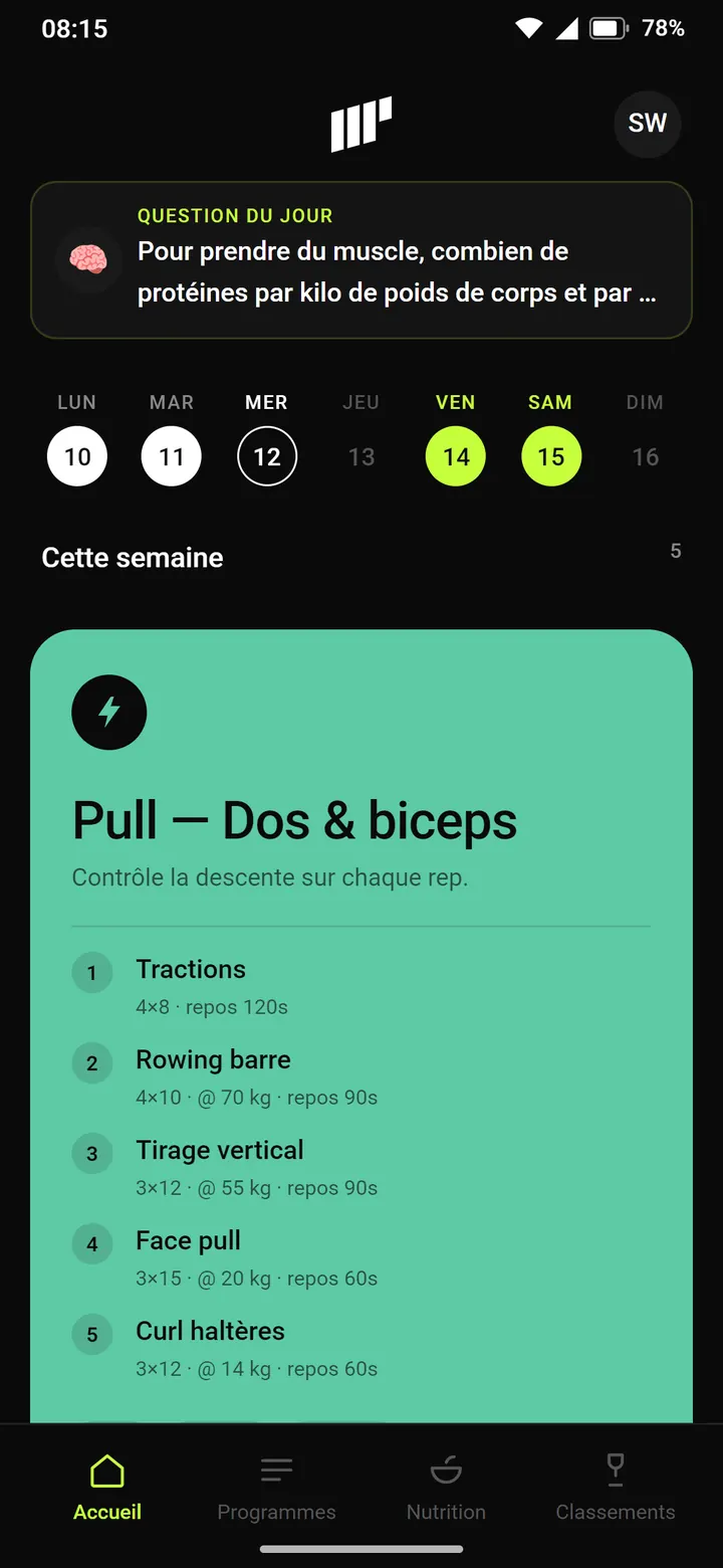
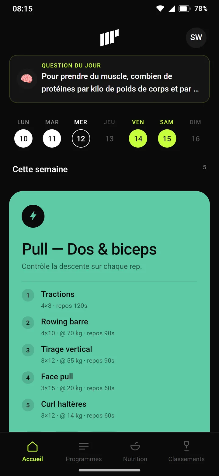
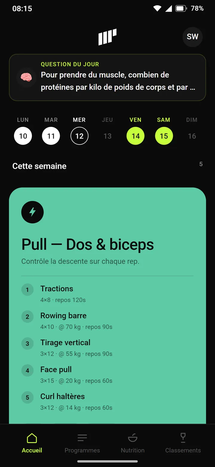
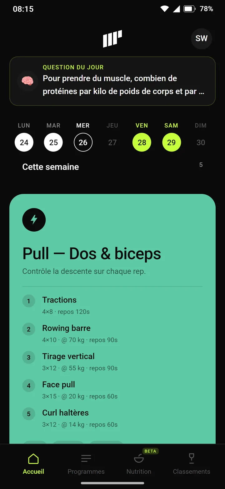
The day before, sessions move to v2: structured exercises and a session type (Gym, Running, Hyrox…). The large card drops the fixed volt for its discipline's color, sea green for the gym. The button stays black and takes that color for its label.
See it in the film ↕ the screen scrolls
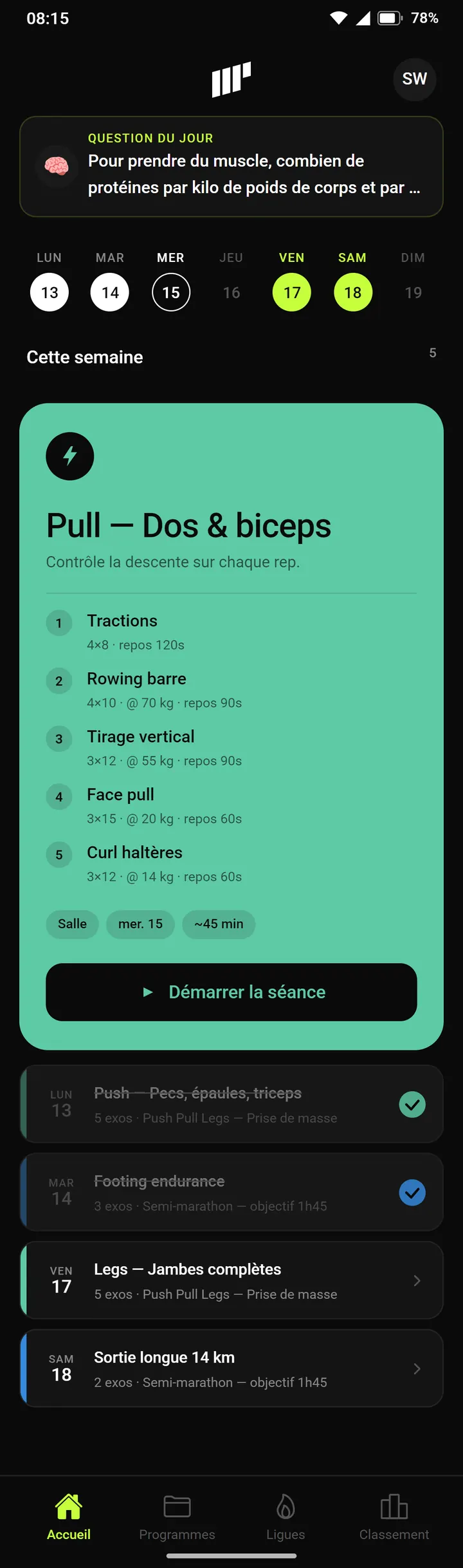
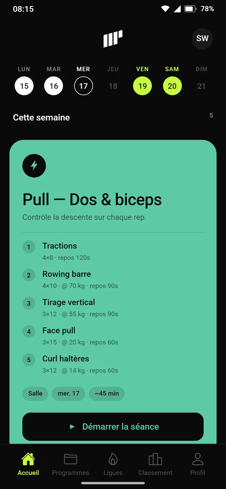
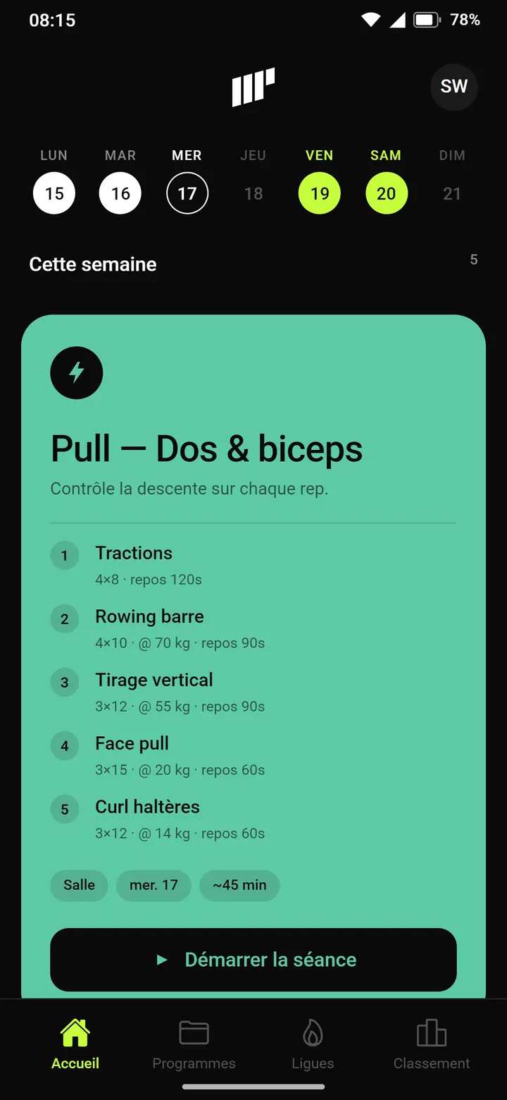
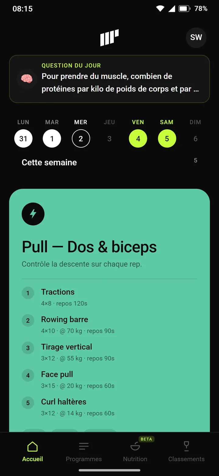
A card settles at the top of the home screen: the question of the day, with its streak and its notification. Meanwhile, the tab bar has changed: on June 18, Leagues moves in and Profile moves out. It now opens from the avatar.
See it in the film ↕ the screen scrolls
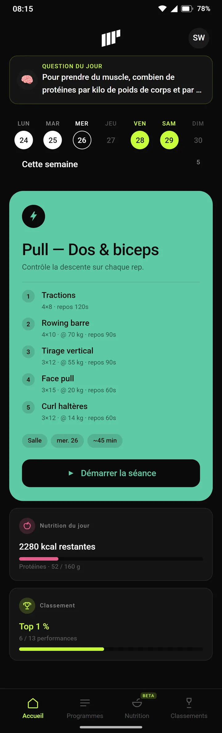
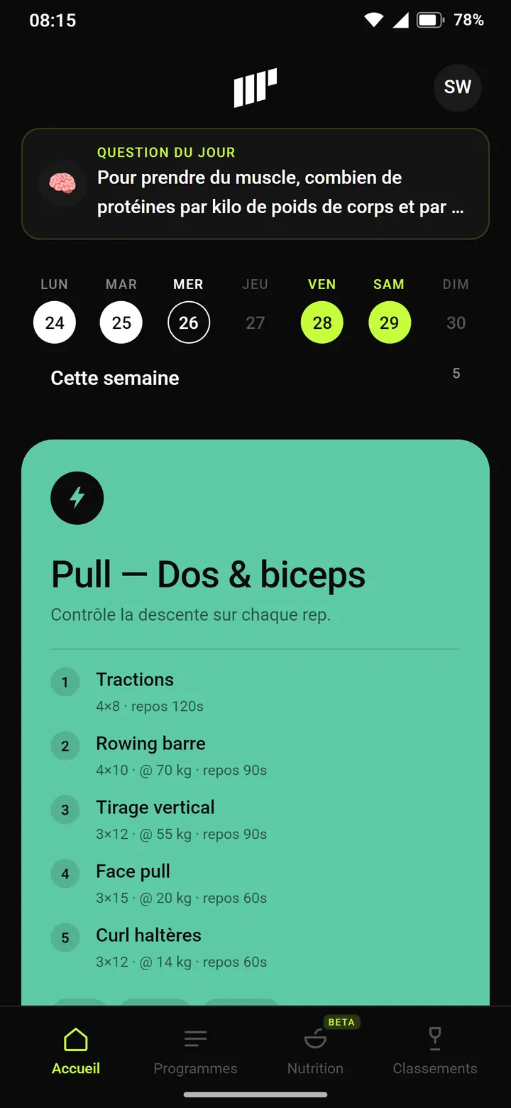
The list of the week's sessions leaves the home screen. Under the session card come two cards: today's nutrition, with calories left and protein, and the ranking, with the top % and the number of performances entered. Nutrition, added to the tab bar on August 12, now carries a BETA badge.
See it in the film ↕ the screen scrolls
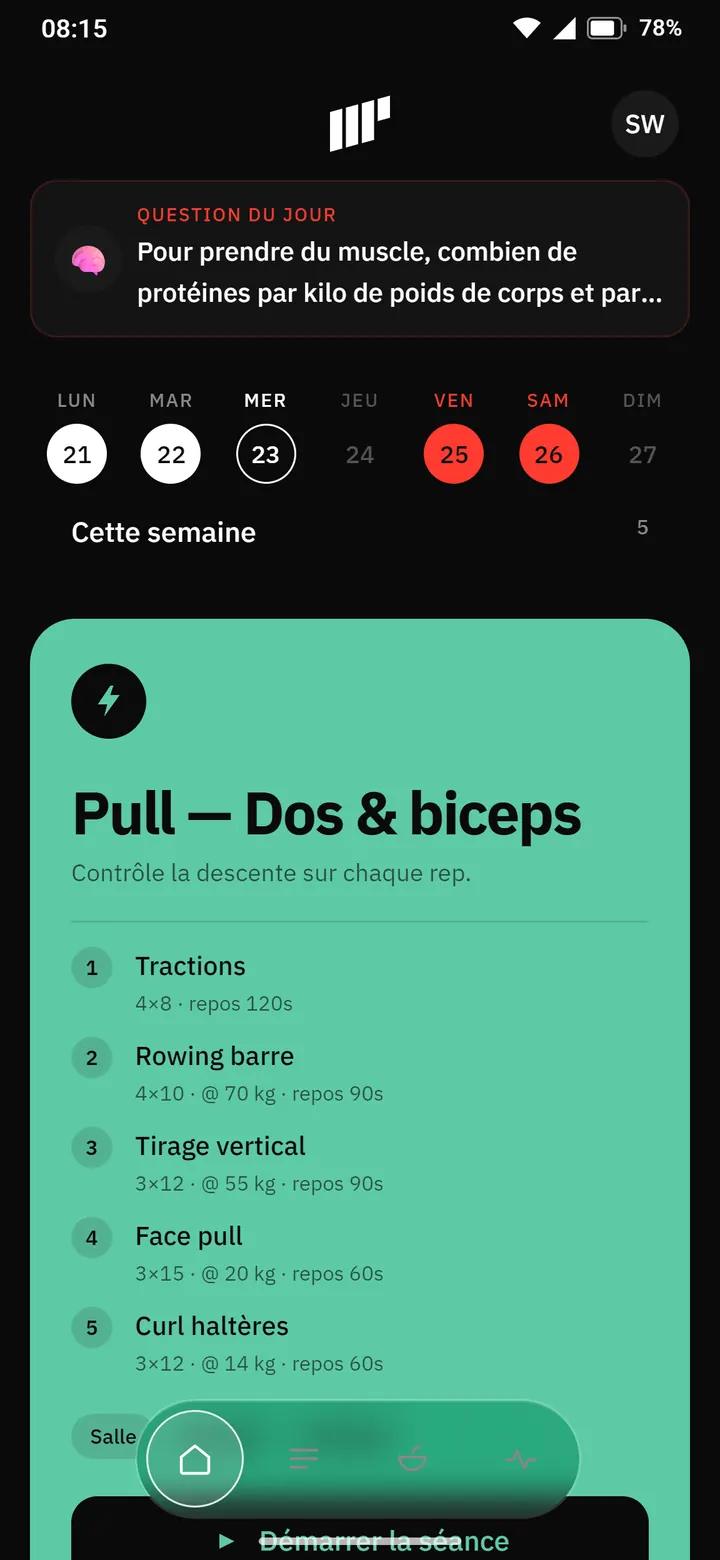
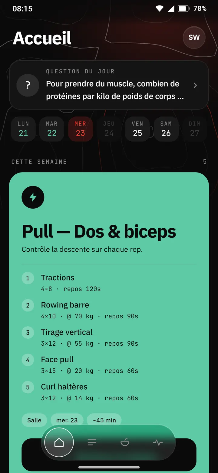
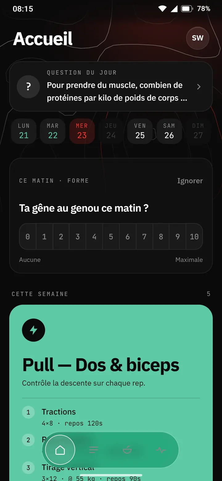
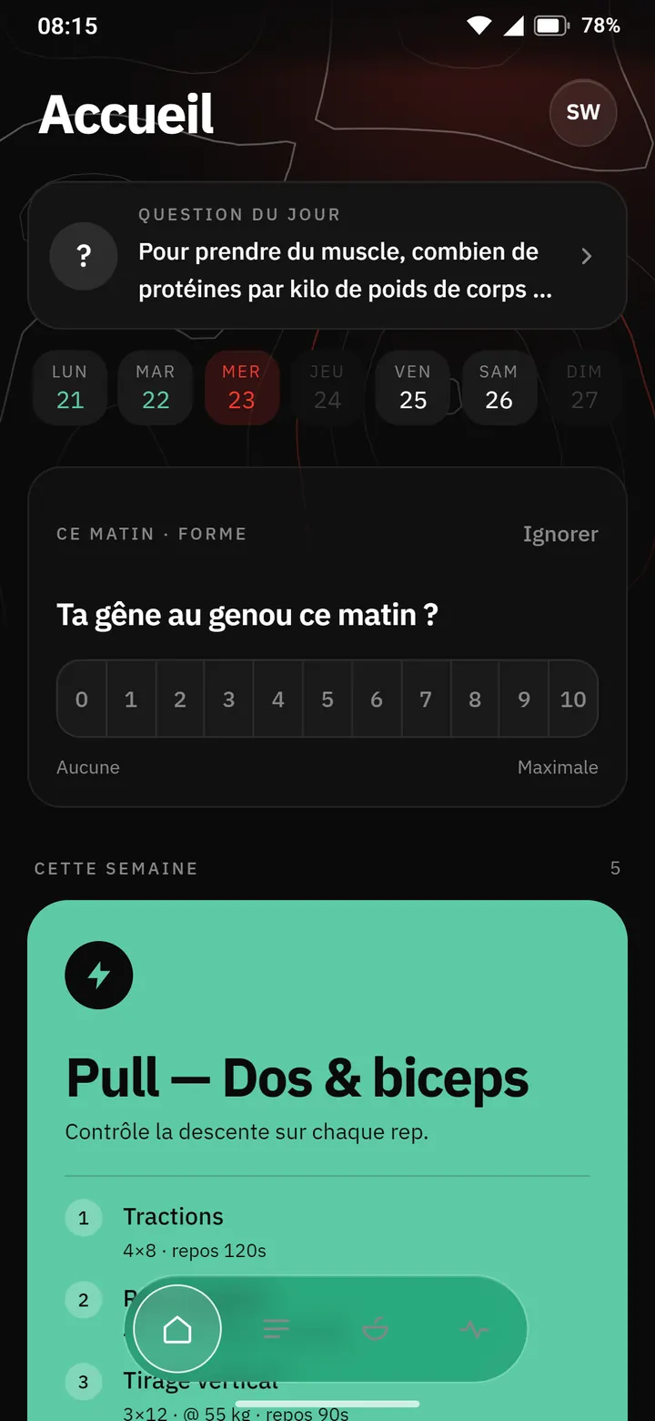
Eight versions in three days. Red, glass, topographic relief, and the day's readiness arriving on the home screen.
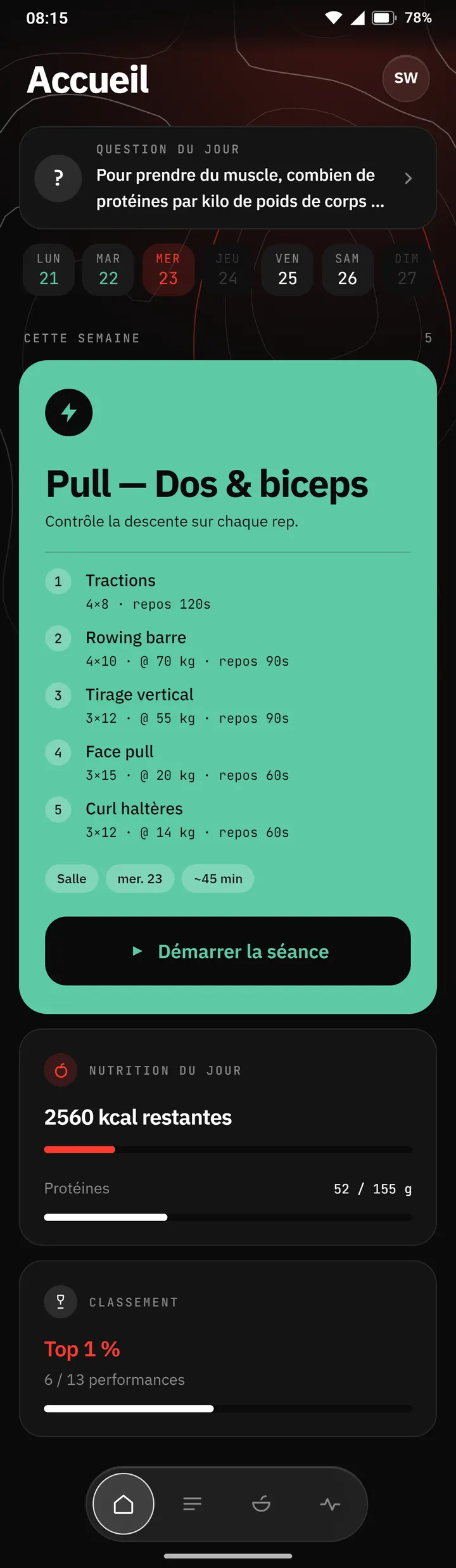
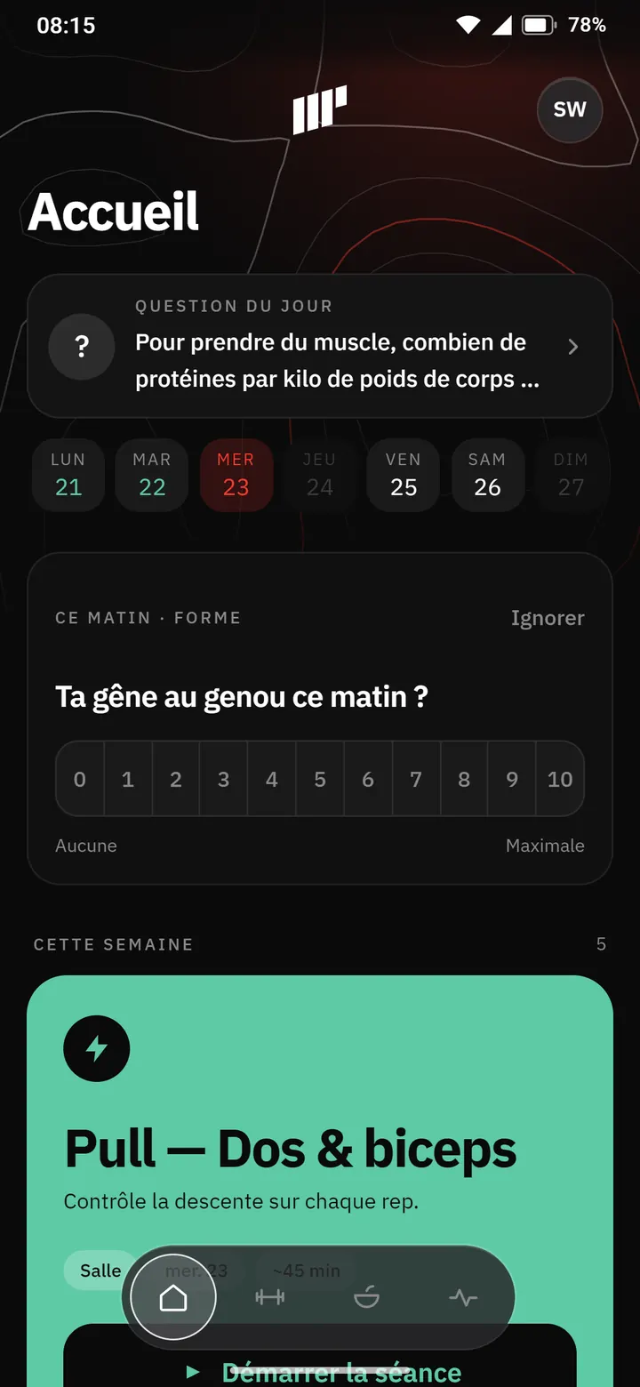
In one afternoon, the app changes its skin. Red replaces volt, IBM Plex Sans and JetBrains Mono replace the system font, and the tab bar becomes a floating glass capsule. The home screen follows half an hour later: a topographic background under a red glow that doesn't scroll, a large title, days as pills.
See it in the film ↕ the screen scrolls
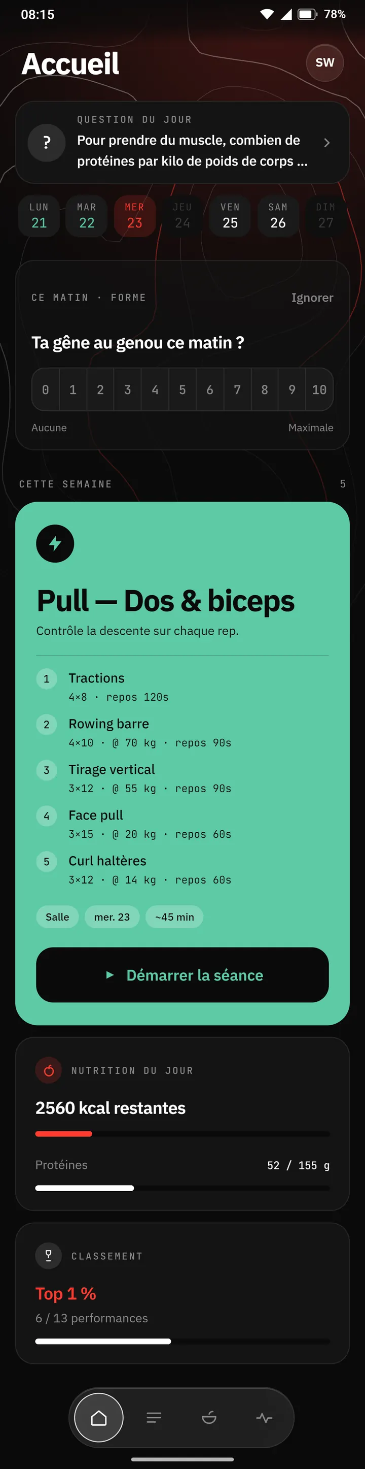
Five minutes later, the Body tab moves onto the home screen. In the morning, a card asks how a reported discomfort feels, here a knee, from 0 to 10. The bar now holds Home, Programs, Nutrition and Body.
See it in the film ↕ the screen scrolls
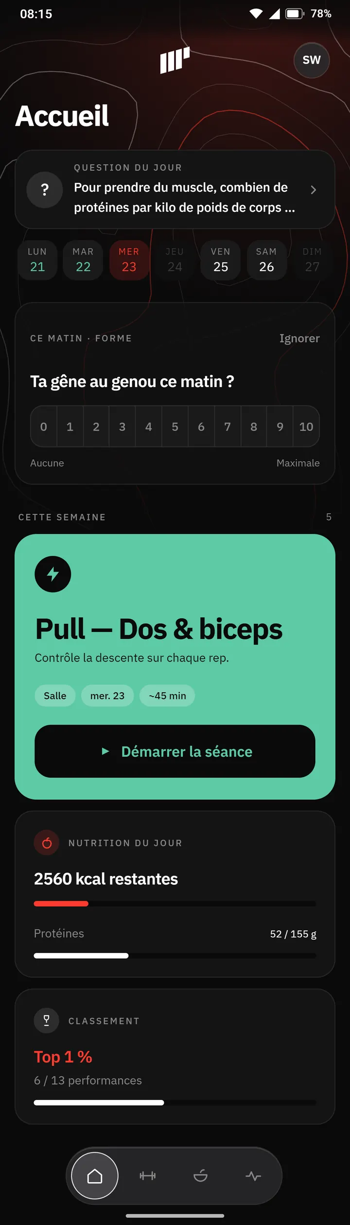
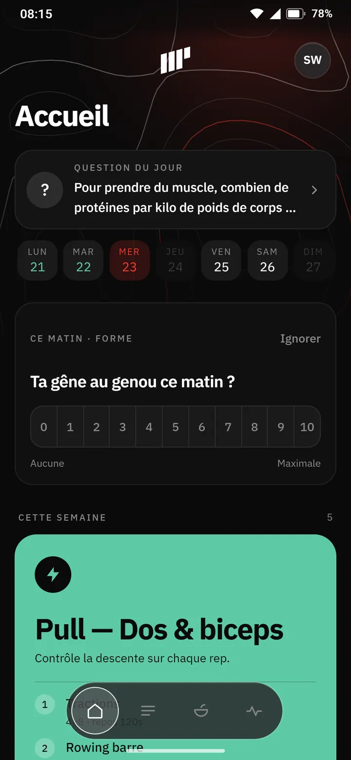
Feedback from the phone arrives the next day. JetBrains Mono goes, leaving a single font. The logo is centered above the title, as on the Nutrition tab. The session card folds down to its title, note, chips and button: the exercises stay inside the session.
See it in the film ↕ the screen scrolls
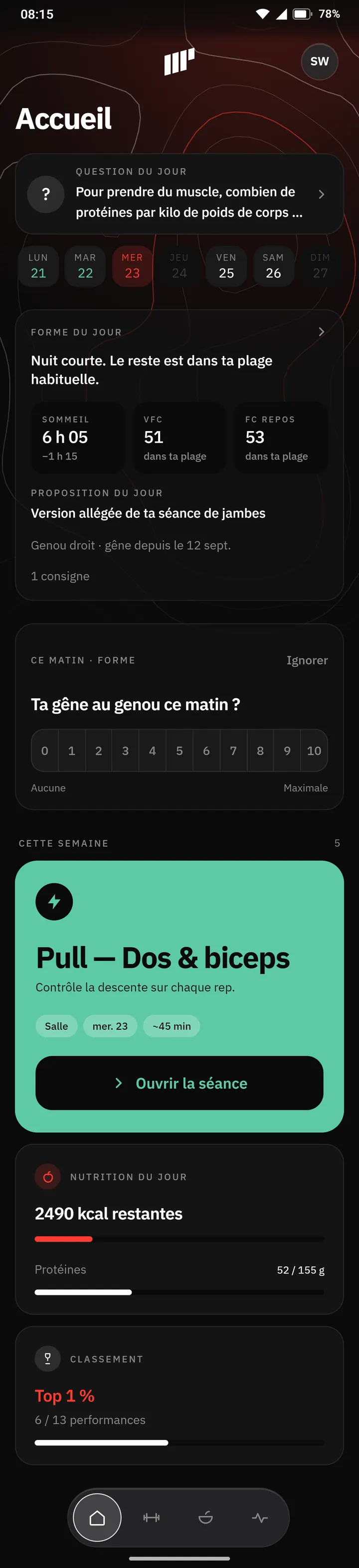
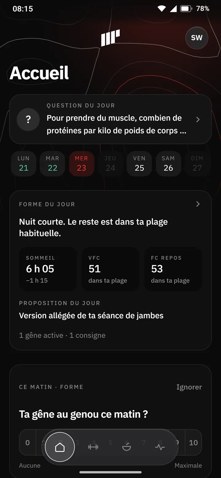
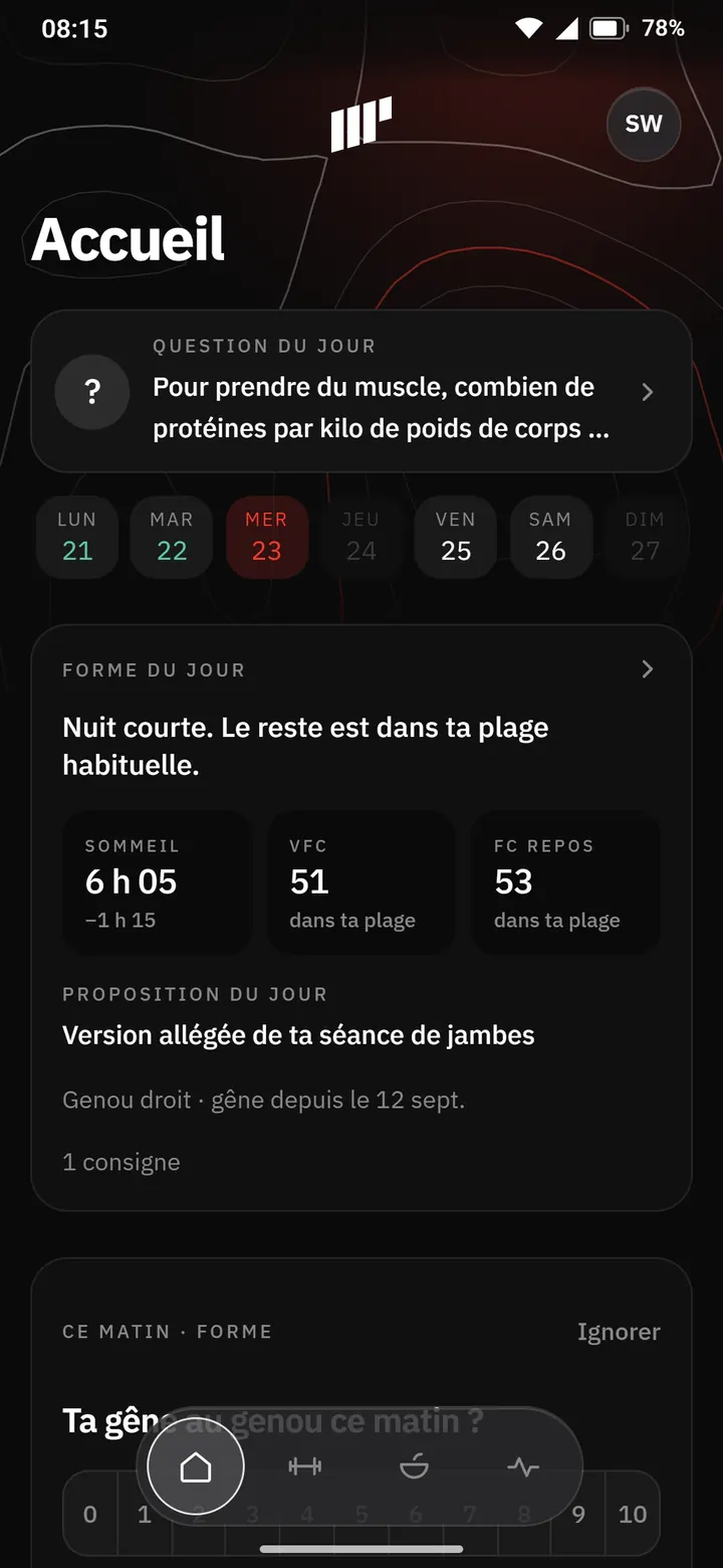
Today's readiness sits between the week strip and the session: sleep, HRV, resting heart rate, and the day's suggestion when a discomfort calls for it. The button now opens the session when it doesn't start the workout directly. Behind the avatar, a notifications inbox.
See it in the film ↕ the screen scrolls
How we did it
These are not period screenshots. The data is made up, the status bar is drawn and the screens don't respond to touch. The visible flaws, however, are original.